
Since smartphones took off, emojis have become increasingly popular – sometimes replacing words entirely.
Google, however, has been slow to keep up with Apple’s constant emoji redesign. Up until now, Android emojis have looked less like people than they did thumbs or gumdrops with faces on them.
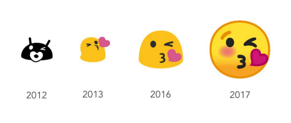
Here is chart showing the progression of Android emojis:
According to Slate, Google has fallen behind in a major form of communication and is now trying to compensate by making its emojis look similar to those at Apple.
Google’s squat blobs aren’t merely a vestigial aesthetic quirk—they’re also a competitive disadvantage in the very serious emoji business. Apple’s iOS 10 featured “a higher a level of detail in the designs—and an adoption of the standard round yellow faces for smilies” that Google’s blobs were hard-pressed to compete against, said the Guardian. Android’s redesigned rounded icons also take after those of Microsoft, another top competitor. Google didn’t prominently tout the recent changes at I/O, suggesting some sense of sheepish defeat on the company’s part, Fortune reported Thursday.
According to CNN, Android O’s redesigned emoji will include a slate of cartoon countenances designed by Unicode, a nonprofit tech industry consortium that works to ensure that the icons display identically across different species of smartphone. “We spent a long, long time making sure that we addressed cross-platform emotional consistency,” Been and Fonts wrote Thursday. “Because one of our main goals with the redesign was to avoid confusion or miscommunication across platforms, we wanted to assure the user that when they sent an emoji to a friend, the message was clearly communicated regardless of whether they are on iOS, Windows, Samsung, or any other platform.”
Now that Google is catching up with its competitors, the rise of the emoji will most likely continue to skyrocket. Who knows, maybe they will replace words entirely. 😉